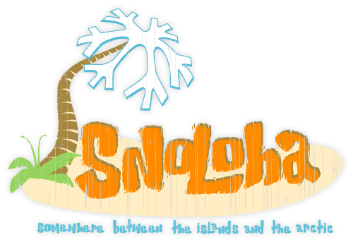
I’ve been spending time reviewing designs for 2012, which includes ones that will be retired, ones that will move forward, and new ones to be introduced. This process involves past sales performance and overall design popularity. I found it very interesting that the design that has taken the lead (with a surge in retail sales this past year) is the very first Snoloha design that we ever created…the Snoloha Island.
I was happy to see this design in the lead, as it’s easily the design that’s had the most thought, stress and time put into it. The Snoloha brand and concept was launched with ‘Snoloha Island’. I remember sitting in my old office at our previous house pouring over color combinations and layouts, trying to figure out how best to incorporate the brand new ‘Snoloha’ hand-drawn font, the SnoFlake Palm Tree, along with the ‘Somewhere between the islands and the arctic’ tagline, all the while thinking to myself ‘what if nobody likes this idea?’
Initially, the design didn’t sell very well and we were never quite happy with the way it turned out on a shirt. It looked so nice on the computer screen, but we couldn’t get it to translate onto clothing. It always ended up being a ‘heavy’ print so it was restricted to either white or a very light color shirt. THEN…we revamped the artwork and gave it a bit of a weathered look, switched up inks and BAM! we can now print on any color we want, and it looks awesome.
On the website it’s currently available in a GALS and KIDS short sleeve. I’ll also be offering this in guys t-shirts, hoodies for fall / winter and finally, NEW hats! (the hat artwork is at the embroiderer being digitized). I’m excited to increase the product selection for this design, it’s one of my favorites.

No responses yet